Alignment
Lonely Planet
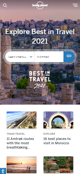
This popular travel guide site uses two different alignments. For the top of the site, the brand logo, title, and search bar are aligned to the сenter. Such a center alignment is ideal for such a short piece of text placed in the background of the photo at the start of the page. All other text below the headline and large photo is aligned to the left. As the visitor views the page's content, scrolling down the page, left-aligning the text makes it easier to read the columns of text as presented on this page.
Repetition
Lexus
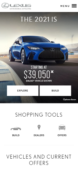
The official website of a famous premium car brand uses a repetition of the same sans serif font with capital letters for words in the text, as well as a repetition of the font color and the same shapes of some design elements. The two action buttons below the advertised sales vehicle have the same rectangle shape and color. Three icons with their description text located just below have the same gray color and font size of the text and are located on the same horizontal line. This consistency in design forms a visually organized look of the page and gives a unique design inherent only to this website of the car brand.
Contrast
AT&T
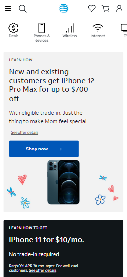
One example of the use of contrast on this site of the American multinational telecommunications conglomerate is the combination of dark and light colors. The top of the page has dark colored text placed on a light background. Further, after the light part of the page, its dark part follows, where, on the contrary, the light text fits on a dark background. This use of contrast helps the reader to separate two texts with different content and also to highlight each of the texts in its own way. The blue action button combined with such a light dark background adds even more contrast to the page design.